MAR
2014
A successful Infographic is interplay of two important factors: content and design. Both aspects play an equally important role in the determining how effective the Infographic is. Below is a selection of some of the vital factors that will help you design a better Infographic.
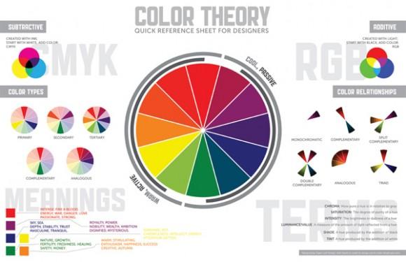
1. Every piece of information has one important point around which the entire graphic should be designed: find that particular point and make it the focal point. The idea behind this is to ensure that the graphic does not end up becoming too dense and overwhelming, because then, the user’s brain will shut off, refusing to imbibe any more details. You do not want that, do you? This point would obviously be present in the form of an illustration.
Image Source: InfographicList
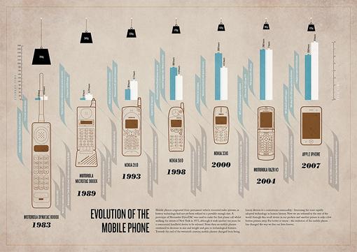
2. Remember that the Infographic should be such that even a layman is able to comprehend it: this art can be mastered with the aid of a magic tool known as a metaphor that will be a visual help facilitating comprehension even by a layman. Scores of boring data that can effectively put anyone off to sleep, may also be made to register if presented cleverly.
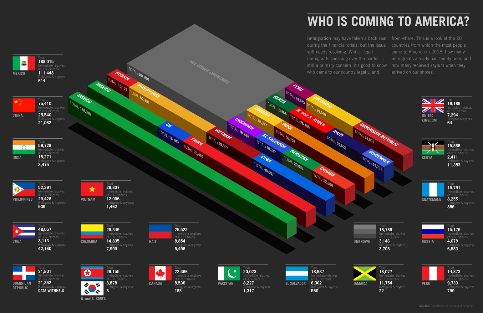
Click on the image to see the full view
Image Source: GoodInfographics
3. Beautify: whoever said that data has to be boring and ugly?? As a designer, it is up to you to ensure that not only is the graphic such that it is easy to comprehend and register, but also such that it looks attractive and add aesthetically to the overall layout of design. Do not be afraid to incorporate a lot of colour and different shapes and designs. Another example to illustrate this point:
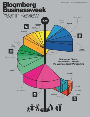
Can you imagine what would happen to the reader if the above data presented were presented in the form of a boring bar-graph or your regular pie-chart? He/she would doze off and the purpose of creating the graphic would be defeated.
Image Source: BusinessWeek
4. Do not shy away from repetition: repetition can be safely said to be one of the core principles of design. Not only does it lead to a visual consistency, but also helps form a kind of trust with the reader. However, it should only be used effectively and within limits. It especially comes in handy when the same data points are being shown again and again throughout the graphic.
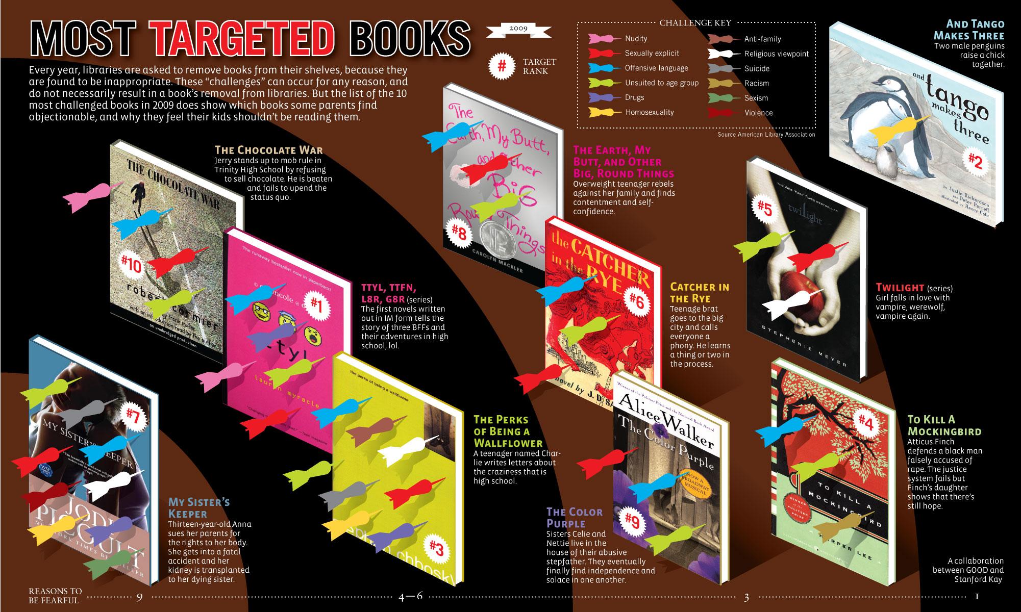
Click on the image to see the full view
Image Source: Easyiehelp
5. Remember the first rule of content presentation: tell a story: Even your Infographic should tell a story. The idea has the same basic rule: that of engaging your customer and ensuring that the details are registered firmly into his / her head. This will happen even more so when the content so presented will be in the form of a graphic or an illustration. Ye another example to illustrate this tip:
Image Source: Flickr
6. If you have to, jazz up the old bar-graph: there are times when it becomes imperative to present the main details through a bar-graph or even a pie-chart. What would you do then? How would you ensure that the graphic does not end up becoming monotonous and boring? The answer is simple: by jazzing it up: incorporate as many illustrations and graphics as you possibly can to make the graphic interesting. Support the graphic with text and help notes that will be encased in interesting shapes and colorful fills.
Image Source: BestInfographics
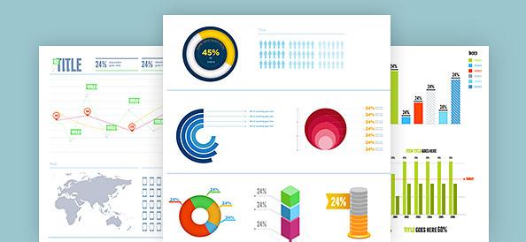
7. Whitespace usage: there are two schools of thought for this: there are designers who would tell you that white would only end up making your graphic boring; and on the other hand there are some who would say that white gives you leeway to incorporate a lot of colour and design, without making the end result overwhelming. The bottom-line is that white should only be used if it ends up making the layout and design beautiful and aesthetically pleasing.
Image Source: Free PSD Files
8. Data research: while the idea is to do away with text, it does not excuse the absolute requirement for research on the information you would be presenting: for if the details you are including turn out to be false, it would only lead to an adverse effect, affecting your credibility. After all, even the images and graphic included are based on the research.
9. Enable sharing: the finished product should be easy to share around in order to ensure maximum outreach for ex: provide the embed code along with the Infographic when you publish it, so that it will easier for potential publishers to re-publish it on their respective sites. Infographic should be clearly visible when posted on any major social platforms, make sure you choose the optimal size.
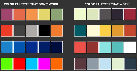
10. Do not be afraid of color: after all the whole point of an Infographic is to present the same old boring information in an interesting manner and form. Use of color serves another important purpose of cleaning up the layout, so that the entire design looks cohesive and put-together. However, be careful of the palette you use. It should not be visually jarring, because then it would do the exact opposite: scare the reader away! The ideal rule is to use a three-color palette.
Image Source: Color Lovers
EnablingBiz eSolutions offers Top-notch Infographic Design Service. For more information call us on +91 8826 175930 or mail us at info@enablingbiz.com . We also offer white-label services to web & graphic design firms in North America and Europe.
Read More


