JUL
2013
Design & Optimization Tips to Make Your Landing Page CLICK – Part I
Posted by : admin in Landing Page (
When we design websites, the content is organized to appeal not only our customers but suppliers, stakeholders, investors, media and general information seekers. This diverse audience calls for a more generic and versatile design. There are number of pages though a visitor usually reaches the home page first. Every visitor finds something useful in the homepage though it may not really be actionable.
Landing page on the other hand is designed with a very specific purpose and targeted towards a particular customer profile. It is often used to usher traffic towards a specific page in the entire website.
What is a Landing Page?
A Landing Page is a webpage that appears when a person:
- Clicks on an Online Advertisement
- Clicks on an Embedded Link in an Email
- Clicks a particular Search Result
- Clicks on specific Keywords
The Landing Page is intended to push or drive a purchase process persuading the Customer to BUY or perform a desired action.
Every Landing Page has a CLEAR and DIRECT Call to Action with a solitary goal. Marketers often employ separate Landing Pages for particular Marketing Campaign.
Landing Pages can be slotted into one of the 7 categories mentioned below:
1. Standard Infomercial Landing Page – This is nothing but a glorified advertisement. It has the same punch line, attractive appearance and attention grabbing attributes. It has very little actionable element.
For example: A page that looks very similar to the advertisement that you might have seen on TV about a mobile phone feature, Internet connection, automobile etc. It will immediately lead to recall of the advertisement that you might have seen on other medium
2. Clickthru Landing Page – This is another simple page which gives information about an offer but beyond that once the visitor decides to ACT, it simply shifts the visitor to the relevant website to take action. There is a constant risk of losing visitor’s attention and poor conversion.
3. Squeeze Page – As the name suggests, these Lead Capture pages aim to gather visitor information often to build a mailing database. They generally ask for Name, Email address, Phone number or more information depending on the objective. Based on the gathered information, tailor-made offers are presented with a higher chance of conversion. The Call to Action is often presented via another Landing Page embedded in emails sent to the people in the mailing database.
For example: An insurance company might gather the above information plus gender, age, height and weight and offer a particular health insurance plan. Similarly, a page might gather information like 2/ 4 wheeler, Make, Model, Brand and Year of manufacture to make vehicle insurance offer.
A travel company’s page might gather information about number of family members, age group, vacation preference (sea beach/ mountain, time of the year, domestic/ international) and then offer suitable packages.
4. Viral Marketing Page - This is a Landing Page that totally thrives to create a buzz in the social media circles just to drum up awareness and arouse the inquisitiveness in people. Quite often these pages have short trailer videos of the product/ event/ cause to sensitize people. The content that is presented is interesting enough to tell a part of the story and leave the viewer craving for more. Usually it goes “viral” as people see it and start sharing it on their social media pages.
5. Landing on the Homepage – The simplest Landing Page is the one that directs the visitor to the company’s official website homepage. It is a risky proposition considering the homepage is too generalized with a string of information about the company, products, mission and vision etc none of which really allows the visitor to stay focused. There are too many distractions and visitors can easily get overwhelmed. The predictable action is that the visitor will move on to some other website or content.
6. Website Internal Pages (Product’s Page) – Every webpage in a company website is a potential landing page. By monitoring and analyzing a customer’s specific requirement or choice, he or she can be brought to the appropriate product page which contains detailed information and an order form to make an immediate purchase. This is a better choice than using the homepage as a Landing Page.
7. Microsites – Larger corporate sites often invest in multiple sub-websites along product lines or brands. This helps create a more structure information schema and balance the traffic. These smaller sites of a larger group are called microsites.
For example: The corporate the Volkswagen Group has multiple automobile brands – Audi, Bentley, Skoda and Volkswagen to name a few. Each of these brands has their unique websites with detailed information about the respective products. This type of structure helps direct customers towards the appropriate brand instead of presenting the entire catalogue and leaving them confused.
Who is a Landing Page designed for? THAT will decide the type of page used.
A Landing Page is intentionally designed for a very explicitly designed marketing campaign or goal with a direct message to a well-defined customer segment persuading them to take a single specific action – BUY!
A Landing Page designer and copywriter has to possess a deep and transparent perceptiveness about the customer segment and profile.
- Who is the customer?
- What is the demographic profile?
- What are the peculiarities of this segment of customers?
- How are they different from others?
- What drives their buying behavior?
- What does the customer expect in the campaign message?
- What is the offer and how do we narrow the gap between our offer and customer’s desire?
- What will grab their attention and create an interest or desire to buy?
- What will propel him into actually buying?
A clear set of data about the prospective customer will make it certain that an appropriate Landing Page is presented to them ensuring that they move forward as per the marketers desired Call to Action.
Quite often it is observed that the Landing Page is unable to generate the desired results. There can be many reasons attributed to the failure. One of the common causes is the copywriting of the Landing Page which is weak, unfocused or confusing for the customer. Customers habitually turn to the Internet for readymade advice. They want Actionable Content where the decision is mostly made for them in the most persuasive manner leaving them the task of just making the payment. Everything prior and post payment is effortlessly managed by the seller to create a delightful buying experience thus, tempting the customer for repeated purchases.
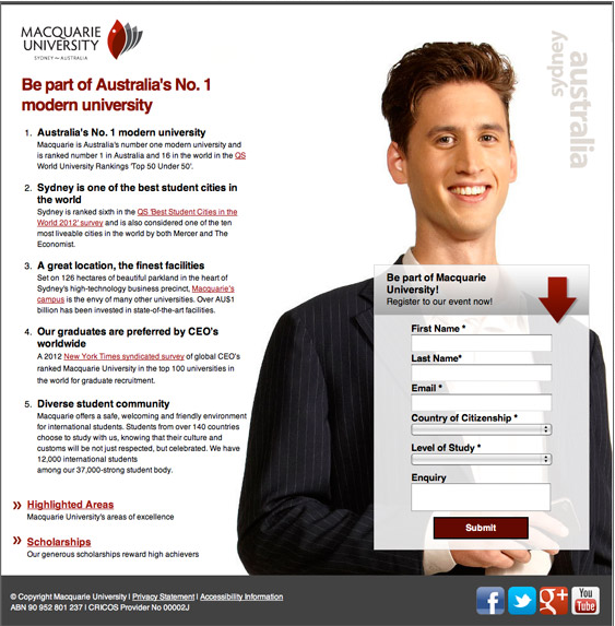
Source: http://www.mq.edu.au/While many run of the mill companies can design an average website and get your company’s identity online, Landing Page choice, design and copywriting is an altogether different marketing approach. It obviously requires professional copywriting skills, technical expertise and seasoned art design capabilities. According to Tim Ash, people skim through web pages and do not read them. If you cannot hold the attention, you lose any chances of conversion. Thus, his advice is to work with professional specialized copywriters to make the Landing Page CLICK.
Email us at info@enablingbiz.com to get more free information and consultation on Landing Page Design and Optimization
Alternatively, Call or Leave a Message on +91-11-30201033.
Go to Part II of this three-part article series
Read More


